Speedomoter For Excel Dashboard

Help creating the speedometer chart for displaying information is becoming a more common request I receive.
As the information available to us increases, so too does the reporting requirements.
Dashboards are becoming increasingly common and while there is a lot of great software out there for displaying information in a dashboard format, there is no reason why you can’t do it yourself in Excel. Below is a simple example of a dashboard with 2 speedometers and a bar chart.

When I started working, this would have been 6 charts or 6 slides in a presentation.
Now quite a bit of information is displayed clearly and concisely.
For this post we will concentrate on how to create the speedometer element.
Before beginning it is assumed that you have at least a basic-intermediate knowledge of charts in Excel.
Speedometer Breakdown
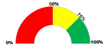
The speedometer is a 2 series doughnut chart – think of a pie chart with a hole in the middle.

The above is how the speedometer would work using default settings and formatting.
The finished speedometer though looks very different, this is because we make half the chart invisible so it looks like half a doughnut.
The colors (green to red) are based on values, as is the position of the needle.
Speedometer Data
I will use the following information for this demonstration.

Starting with the information between A1 and B4.
There are 360 degrees in a circle.
The sum of B1:B4 is 360 – this is not just a coincidence, it is by design.
We know that the doughnut shape is round, but we only want half this shape, so we will have half our doughnut shape designated to be blank. Half of 360 is 180, this value should be 180.
I want the red area to run from 0% to 50%; the yellow area to run from 51% to 75%; and the green area to run from 75% to 100%.
The first 180 is going to be blank, so the remaining 3 values (50%, 25% and 25%) need to be a percentage of the 180 that will not be blank.
See the formula above in B2, the endpoint of my red area will be 50, so we calculate 50 as a percentage of 180.
The yellow area will run from the end of the red area to 75%, which means we need to calculate 25 as a percentage of 180 – it is the same then for the green area.
These calculations are for the set speedometer area (that will not change).
We will work on moving the needle in a bit.
Create Speedometer background
Highlight B1 to B4 and insert a doughnut chart type.

- We don’t need the legend so you can remove that (Chart Tools > Layout > Legend > None).
As you can see the blue area on the right hand side covers half the doughnut.
We want to change the doughnut so that this blue area is the bottom half of our doughnut.
- To do this, click on the doughnut so the whole series is selected.
- Right-Click and Format Data Series.
- Change the rotation to 90 degrees.

Now the bottom half of our doughnut is the blue area.
- Select just the blue area (you may need to click on it twice so only this area is selected)
- Right-click and Format Data Point
- Change the Fill to No fill

- Repeat for the other data points, but use a solid color fill.
- You might also want to add a grey border line (or you may not – it is entirely up to you).
Now our speedometer is starting to take shape!

- Add and rotate text boxes with the indicator points.
- Make sure the text boxes have no fill and no border.
- If the border around your chart area is getting in your way you can get rid of it by selecting the chart area, right-clicking and formatting to have no line for Border Color.
Now we are ready to add our needle.
Speedometer Needle
The data used so far in our speedometer was to create the background to the speedometer.
Now we will add a needle which will communicate some information, in my case what percentage of invoices were paid on time.
I have added a little bit more data to my file.

Cells A12 to A14 contain the information that I want to communicate.
Of 393 invoices processed in this period, 319 were paid on time which equates to 81.2%.
- In B6, make our Value be the % Paid On Time x 100 (to make it a whole number).
- In B7, Needle Size will be the thickness of our needle (this can be changed if you’re not happy with 2).
- B8 is 200 minus the Needle Size and Value. Why 200? 100 will be the bottom half of our chart (which we don’t want) and 100 will represent 100% of the top half of our chart (where the needle will appear).
We want our needle to show the percentage paid on time was 81.2%.
- Click on our existing chart.
- Go to Chart Tools > Select Data.

- Click on the Add button.
- Our series name will be Pointer.
- For Series values, select the Value, Needle Size and End Point values (B6:B8).

You should have an ugly looking chart on your screen, this is OK, it is a doughnut chart trying to show two different series.

We will take our second series for our needle (the outer doughnut) and add that to a secondary axis.
- Select the outer doughnut to select the Pointer series.
- Change the chart type to a pie chart.

As we did earlier for the doughnut chart, we need to rotate our pie chart.
This time we need to rotate it by negative 90 degrees, which isn’t an option so we rotate it 270 degrees (360 – 90).
- With just the pie chart selected, right-click and Format Data Series.
- Change the rotation to 270 degrees.
- Change the Plot Series On to be Secondary Axis.

Your pie chart will now be covering your doughnut chart.
Even though this looks less like your finished result now than before you did the last format, this is OK.
- Click to select just the blue area of the pie chart (you may have to click twice to select it).
- Right-click and format it to have no fill.
- Repeat for the green area of the pie chart.
- For the small piece of the pie chart remaining, format that to have a black fill

Now it is finally starting to look like a speedometer!
You can change the thickness of the doughnut ring if you wanted.
- Select the doughnut chart only (you can use Chart Tools > Layout > Select Series 1 from the selection drop down on the left side of your menu ribbon).
- Right click and Format Data Series
- Change the slider on the Doughnut hole size until you are happy with it.

Enhancing the Speedometer
You can further improve your speedometer by adding a text box below it to act as a label for what the chart is showing – in my case I used “% of number of invoices paid on time”.
This chart shows at a quick glance that our percentage is above our target – it is in the green area.
But for somebody that wants to know a bit more detail like the actual percentage value, you may want to add another text box.
I have added a text box in the hole of my doughnut (at the minute it contains XXXXX so you can see where I put it).
There is no fill or border line on this text box and i made the font size bigger (32).

How do you set up the text box so it shows the value automatically without you having to update it every time?
- Select your text box, if there is any text in it, delete it.
- With the empty text box selected, in the formula bar (do not type into the text box itself) enter “=” and then select the cell with the value you want to display.

My text box above will change whenever the value in B14 changes, I do not have to edit the text in the box every time I update the file.
Dashboard
So there you go, that is how you create a speedometer type chart.
These are useful (and look well) when used in dashboards, beware of overusing them though – it can quickly go from being useful and impressive to having the opposite effect and resulting in information overload.
For the background to the dashboard you can use an texture image or gradient fill, whatever you like the look of most.
Try it out yourself, change the colors, add more color zones, change the values of the zones, customize the speedometer and make it work for you… don’t feel limited by what you think Excel can do.