Pareto Chart In Excel

Although there are Excel add-ons and more recent versions of Excel make it easier, for a lot of people Pareto charts are still awkward to put together.
A pareto chart is a type of chart that contains both bars and a line graph.
The bars show the individual order of items in descending order and the line represents the cumulative total of the bars.
This post will cover creating a bar chart and a line chart on a secondary axis.
Some versions of Excel have combi-charts which do this for you – you can skip these steps if you have this options.

In the last post we created a formula to get the first, second and third highest values. This resulted in us having a table like this.
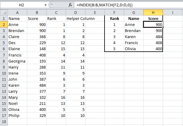
You can replicate this sheet yourself if you want to follow along this post.
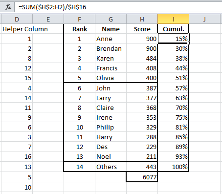
For this post I have added more values, from 6 to 13 and then the 14th value will be the sum of all remaining scores and just given the name “Others”.
The formula in G2 and H3 is copied down as far as row 14.
In G15, I have entered the value “Others” and in H15 the formula to get the remaining sum of scores is =SUM(B:B)-SUM(H2:H14).
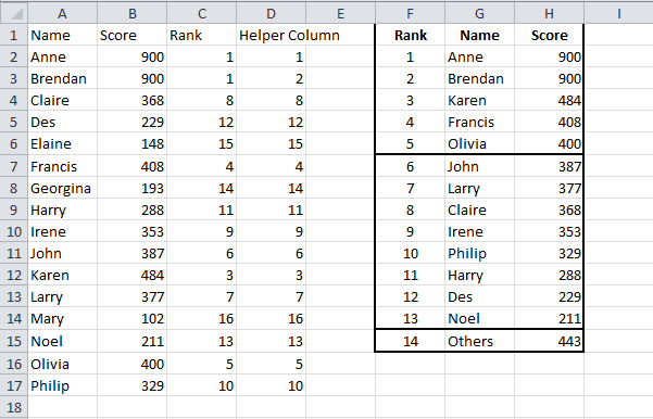
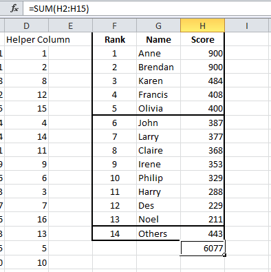
Column H is totalled.
If we created a bar chart now, our bars would appear in descending order, which is what we want in our Pareto.
If you were to create a bar chart of the names and scores in columns A and B, it would be like the chart below, not in order.
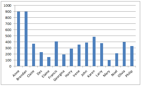
This is why we used the formula to retrieve the highest, second highest and so on values, in that order.
Our bars would already be in order if we created the bar chart now, the next part we need for our Pareto is the values for the cumulative line.
I like to base the cumulative line on the cumulative percentage of the total value.
In column I, I add a formula to calculate the cumulative percentage.
- =SUM($H$2:H2) I want to get the cumulative scores which will be from H2 to H2 in row 2, for row 3 it will be from H2 to H3 and so on. That is why the first H2 has dollar signs to make sure the range is always from H2.
- /$H$16 we want our cumulative scores as a percentage of the total score in H16. Again note the use of dollar signs to ensure that H16 is always referenced and doesn’t change to H17, H18 and so on as the formula is copied down.
Copy this formula down for all rows.
We’re now ready to create our Pareto chart.
Creating a Pareto Chart
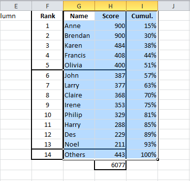
- Highlight the names, scores and cumulative values from G1 to I15.
- Click on Insert
- Select a 2-D column chart (the first one below)

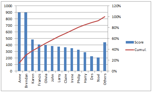
This creates the bar chart below.
The cumulative percentage values are so low, you don’t even see them on the chart.
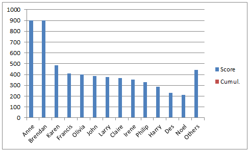
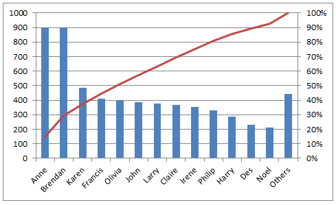
We want to add the cumulative values to their own axis.
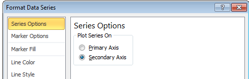
Under Chart Tools > Layout ribbon, select the cumulative series for the “Current Selection” section.

In the same section, click on Format Selection and plot this series on a Secondary Axis.
With this series still selected you can now change the chart type.
Under Chart Tools, go to the Design Ribbon and click the Change Chart Type button.
Select the first Line chart.

This gives us a basic Pareto chart.
With a couple of tweaks we can improve the look of the Pareto Chart.