Using Charts To Help You With Problem Solving
It is well known and well publicized that graphs and charts can be used to demonstrate and present data visually to an audience. The visual of the data can highlight points of data quicker and easier than just numbers in a table.
One thing that I have noticed over the years is that when talking about charts and graphs, it seems to usually refer to presenting data to an audience.
When working on projects, or problem solving I find creating charts for me can be hugely beneficial.
Even without statistical packages like Minitab, Excel can create charts to at least point you in the right direction. There are add-ons to Excel that you can buy to create more analytical charts like paretos, multi-vari study charts, etc.
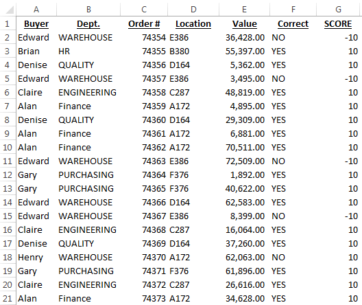
Below is an extract from a table of data relating to Purchase Orders.

In the example I am about to use there are 100 orders, some of them were processed correctly and some incorrectly.
This example is based on a real life problem I came across where 3 people had to get together every month to review transactions for that month, identify incorrect ones and then correct them. A team was tasked with finding out why the transactions were incorrect and fixing the problem to avoid incorrect transactions in the future.
My example has 100 transactions and 6 columns. The real example had over 1,000 transactions and dozens of columns of information.
The theory behind what I am about to show you and what was actually done is the same though.
I want to analyse the transactions that were correct and incorrect (column F).
In order to plot this on a chart I will assign them numeric values.
Filtering column F, for all “YES” I gave a value of 10 in column G. For all “NO” I gave a value of -10 (negative) in column G.
First Chart – By Buyer Name
- Sort the table by the buyer name in column A
- I will create a simple bar chart.
- The series will be based on the numbers in column G
- The horizontal axis will be the list of buyer names in column A

Note that sorting by name first groups the names in the chart.
Nothing stands out initially, all users have both correct (above 0) and incorrect (below 0) transactions.
Second Chart – By Department
- Sort the table by the department name in column B
- Change the horizontal axis from your previous chart to the data in column B

Note that I don’t create another chart, I just change the horizontal axis on the chart already created. This makes these checks faster to do.
Third Chart – By Location
- Sort the table by the location in column C
- Change the horizontal axis from your previous chart to the data in column C

Possible Solution
It was at this point that it was noticed that all transactions for all locations except 2 were correct and all transactions for those 2 exceptions were incorrect.
The team now had a starting point to understanding the problem.
It was later found that the setup for certain locations were different to others and this was what was causing the problem.
Without an analysis like this, the problem would have never been identified, investigated and corrected. Instead the team would have continued getting together every month to review and correct transactions.
Minitab would have been faster and given more information, but without MInitab normal charts can be a cheap and alternative.
[grwebform url=”http://app.getresponse.com/view_webform.js?wid=4307503&u=CucD” css=”on”/]