Using Pivot Charts For Better Analysis

Using Pivot Charts when analyzing data can show you more in one image and quicker than standard charts where you may have to create multiple charts.
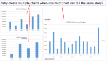
In this image, there are two standard charts showing the sales by person and the sales by region.
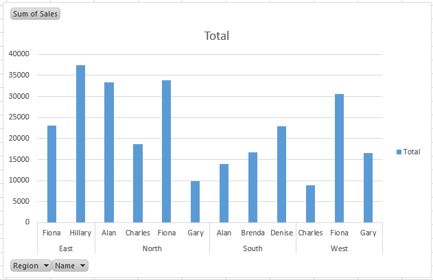
But to the right we have a Pivot Chart which shows the sales by person and region in one chart.
Creating Pivot Charts is easy once you understand Pivot Tables (click here to read about Pivot Tables).
I have created a table based on a table of information below.
Click on the Pivot Table and you will see PivotTable Tools options.
Towards the right-hand side of the Analyze menu, there is a “PivotChart” button.
Press the button and select the chart type you want, I am using a standard clustered column chart.
This creates a chart based on the pivot table.
As you can see, the sales in each region are broken down by person.
You can also apply filters to the Region and Names displayed by using the grey buttons.
Changing the layout of the information displayed is the same as changing the layout of a Pivot Table……. simple as that!!
You can play around with the layouts, chart type, filters and the other format options of the table.
With a bit of practice you can quickly and easily create informative charts in no time.


