HTML5 CSS LAYOUT
So, you can display text and images on screen, you can insert numbered lists and bullet point lists, you can change elements of the page, but you’re probably not feeling as warm and fuzzy about your website as you feel.
Let’s look at HTML5 CSS Layout now, “div” in particular and then hopefully you will start to feel the onset of warmth and fuzziness.
This post can be treated as a standalone post, but you must know the basics of HTML5 and CSS already, or you can follow the series of posts. The previous posts are:
HTML5 CSS Layout
Div
Basically, the div divides web pages.
Div itself has no effect on the styling of what is contained within it, it is just used to divide up the page into distinct sections – I say “just”, but I don’t mean to understate the usefulness of div, in fact except for separate CSS files, I think it is one of the better parts of HTML that I have come across in my experience.
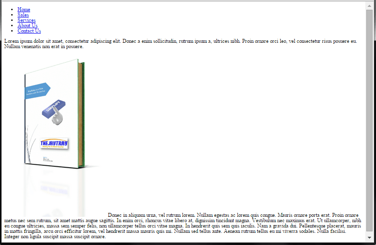
If we take a sample page that we can create based on earlier posts we might get a layout like this.

In reality I wouldn’t have a border around every section as above, I have them in this example just to demonstrate the layout.
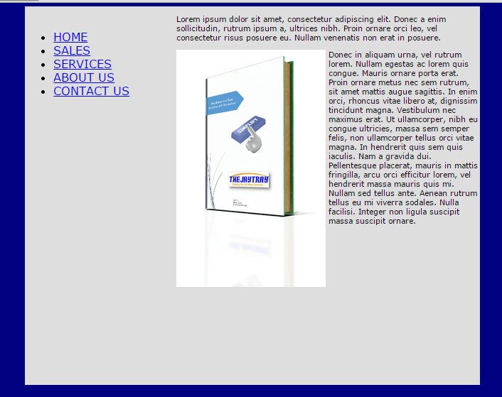
When designing pages, we would probably rather a layout more like this

The second image looks better doesn’t it? …and more likely to induce the fuzziness we have been looking for!
The div tag is what we will use to achieve this .
Think of a div as a container, and use it as such.
Each part of our web page will be broken up into sections and all of these sections will be contained within one bigger section.
Having a div inside another div is called nesting.
Give each div a unique id and for the sake of simplicity, give the id a name that makes sense.
The div has an opening <div> and a closing </div> tag.
When nesting div’s make sure to include the closing div. To make it easier for me to see the starting and ending point of any div, I use indexing.
Starting HTML5 CSS Layout Files
I have created a blank HTML5 document which links to a “css-layout.css” file (line 8) which is saved in the “css” folder.

At line 12 I am going to enter my div’s.
I have 3 div’s.
- main_container will be the whole page and contain the other div’s
- nav_menu will be the navigation menu
- main_content will be all other content of our web page

nav_menu
The first div we will populate will be the navigation menu. This will be an unordered list and each list item will be a link to another page.
For now the links will just be placeholders, that is, I will set them up as if they are links, but instead of entering an actual address, I will just put in a “#” for now. See lines 14 to 20 below.

main_content
The next section to fill in is the main_content div.
I will put in text, an image and then some more text. I will use some dummy text and also one of the images already used in my site.
Lines 22 to 39 make up the contents of the main_content div. You should already be familiar with <p> and <img>.

This is how our site looks so far
Now we will change the CSS of our page and make use of the div id’s we have set.
Setting Layout With CSS
body{}
First, let’s give the body of the page some color and define the font.
- body{
- background-color: navy;
- font-family: Verdana, Helvetica, Arial, sans-serif;
- }
font-family
By setting a font-family, we are defining the font-style that we preferred the browser uses.
If the browser does not support Verdana, then it is to use Helvetica. If it doesn’t support that, then it is to use Arial. Failing that, it is to use a sans-serif font.
div#main_container{}
The first div that we will style will be our main_container.
We will set the width as 960 pixels, the height as 600 pixels, the margin and overflow to auto and we will give it a different background color to that of our page, so it is easier to see on screen.
- div#main_container{
- width:960px;
- height:800px;
- overflow: auto;
- margin: auto;
- background: #DEDEDE;
- }
960px
The first thing we will do will be to set the width of our page to 960 pixels (px).
Why 960?
1024px used to be the optimum width of screens, so when designing a page that you want to set the width for, you are better off making it smaller than 1024px to allow for design of the browser, scrollbars, etc.
That doesn’t answer the question…. why 960?
960 is easily divisible by lots of numbers 1-2-3-4-5-6-8-10-12-15-16-20-24-30-32-40-48-60-64-80-96-120-160-192-240-320-480-960.
If you took another number, 1,000 for example, that is divisible by 1-2-4-5-8-10-20-25-40-50-100-125-200-250-500-1000.
Using 960 give you more options to easily create a variety of different width columns in your page.
height & overflow
We are setting the height (length) of our page to 600 pixels.
Why 800?
I would like to come up with a clever mathematical answer like we have for the 960px, but the truth is….. I’m guessing.
If 800 pixels is too much or too little, I will change it later.
By setting a height, I can have a bit of control when it comes to making sure all columns are the same width and I find it easier to align things.
The overflow tells the browser what to do if it cannot fit everything into the set width. “auto” means that if there is too much text to fit in the div, then add a scrollbar.
I would advise against coming up with a high value for height “just in case”. By having long columns with a lot of empty space at the bottom, when the page is displayed on a narrower screen, you may end up with a lot of blank space between each section. I usually guess the size, populate the content and then decide if I need to change the height or not.
margin
The margin property defines if an item is to sit right on the border, or if there is to be a gap between the object and the edge.

In the above example, the margin moves our inner box away from the left border of the outer box. There is no margin on the right, so it goes to the edge.
Adding a margin can improve the look of elements of your page by making them stand out and look separate to the overall page.
By setting the left and right margins to auto, we are basically putting our div container in the center of the page.
If a person is viewing the site on a big screen, the CSS will put our div in the middle, if it is a smaller screen with say 1024 resolution, then our page will fit in the center with less of a margin. The important thing to note is that we do not have to work out where the center is, auto margin does that for us.
div#nav_menu{}
We will allow one third of our width (320 pixels) for the nav_menu.
The menu width itself will be 280 pixels wide, but we will allow 20 pixels on both sides for the margin (280+20+20=320). When working out the width of your content, you must also include the margins in any calculations.
We will also allow for a top margin, to move our menu down a bit from the top of the main div.
- div#nav_menu{
- width: 280px;
- height: 750px;
- float: left;
- margin: 20px;
- margin-top: 25px;
- font-size: 150%;
- text-transform: uppercase;
- }
There are a couple of new lines here to look at before we look at the page as it stands.
float
By floating our menu div to the left, this means that the remaining div’s will be moved to the right of this (if there is room). In our earlier code we would have the menu dive and then below that we would have our content div.
text-transform
The menu items would look better in uppercase, so I use the text-transform line to do just that.
This is how our page looks so far… It already looks more like a webpage than before.

img{}
In the second paragraph of our main text, we have the image and then the text in the paragraph.
This means that the text will begin at the bottom ‘line’ of the image. If we wanted the text to line up to the right of the image, from the top, then we can set the image to float left and also put in a small margin so there is a bit of a gap between the image and text.
- img{
- float: left;
- margin-right: 5px;
- }
Just a few lines of code can make a big difference to your layout.
… feeling warm and or fuzzy yet? No? Ok, let’s continue.
div#main_content{}
The main_content div will not have much styling that we haven’t already seen.
We will give a top margin to move it down inline with the nav_menu div and also a small border on each side.
- div#main_content{
- width: 950px;
- height: 750px;
- margin: 5px;
- margin-top: 25px;
- }
If you refreshed your browser now, you probably wouldn’t notice much of a difference, but later if you wanted to tweak your page you have most of the work done by now.
Animating The Menu
The finishing touches to our nav_menu div will also include styling and animating the nav_menu.
Before doing this, in the html file, assign the id “nav” to the opening <ul> tag for the menu list.
ul#nav a{}
The first styling change to make will be to the anchors (a) in the nav unordered list (ul). We will take away the text decoration, change the color and set the weight to normal.
- ul#nav a{
- text-decoration: none;
- display: block;
- font-weight: normal;
- color: #666666;
- }

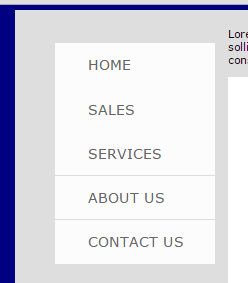
ul#nav li{}
The next thing to do will be to style the list items in our menu. One of the things we want to do will be to remove the bullet points from the unordered list.
- ul#nav li{
- margin: 1px 0px;
- padding: 20px 40px 20px 100px;
- list-style:none;
- position: relative;
- background: #fcfcfc;
- }
padding
Where the margin applies a gap outside the div, the padding applies a gap between the edges of the div and the contents of it. You can see a gap between the left, top, right and bottom borders of the div and each line in the div.
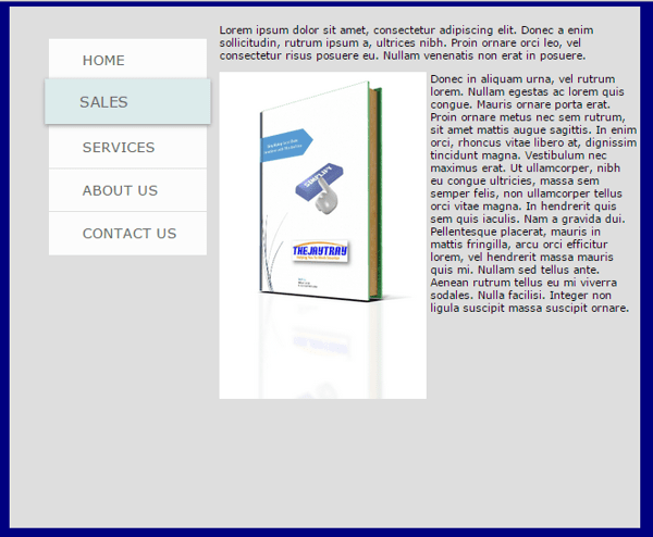
ul#nav li:hover{}
This is our animation section. Essentially, what we are doing here is styling the list items of the unordered list nav, when the pointer is hovering over an item.
We will change the background color and size as we hover over each item.
- ul#nav li:hover{
- background: #dcebeb;
- -webkit-transform: translateY(-3px) scale(1.05);
- -webkit-box-shadow: 0px 2px 7px #999;
- box-shadow: 0px 2px 7px #999;
- -webkit-animation: all 0.15s linear;
- z-index: 1000;
- }
When I started writing this blog I forgot the fact that I would have to explain each of these, so here goes!….
-webkit-transform
The transform method allows you to make changes to an element which will move, rotate, skew or scale it.
The first part “translateY(-3px)” will move the list item down 3 pixels – which is -3 pixels on the Y axis.
The next part “scale(1.05)” will increase the size of the li by 5%.
This line will make our list item bigger and move it slightly down when we hover over it.
-webkit-box-shadow & box-shadow
The box-shadow allows us to apply a box shadow around our list items. The four values making up the properties are:
- 0px – The first value relates to the horizontal value of our shadow (if a shadow is to the left or right) and how far out the shadow goes. A positive number would be to the right of our element, a negative number would mean a shadow to the left.
- 2px – The next number relates to the vertical value of our shadow. A positive 2 means the shadow will be 2 pixels below the box. A negative number would mean a shadow above our box.
- 7px – The blur radius defines how blurry or sharp the shadow will be. The higher the value, the blurrier the shadow will be.
- #999 – This is the color of the shadow.
The -webkit prefix on our box shadow is for the sake of Safari and Chrome rendering engines. Internet Explorer and more recently, Firefox will ignore this and use the box-shadow line.
Previously you would have had to include a -moz-box-shadow for Firefox.
This code might not render properly in older browsers, but as these browsers get updated, eventually these older browsers will make up a very small percentage of your site visits, and are probably not worth worrying about.
-webkit-animation
We want to animate all our transformations over 0.15seconds.
The linear value means we want the animation evenly spread out over the set time from start to finish (so it doesn’t start fast and then slow down, or vice versa).
z-index
The z-index relates to the stacking order of elements. The element with higher index values will appear in front of elements with lower stack values.
So, when we increase the scale of our element the pointer is hovering over, we do not want to push all lower elements down. We want to keep them where they are.
By setting a high z-index for our hovered item, all other elements stay where they are, our element increases in size but any part of it overlapping another element will appear in front of the lower stacked element.
So, there you have it…
… your very own webpage.
Change the margins, the padding, the colors, the borders, whatever you want. Save your changes and refresh your browser to see the results.
From start to finish the above page took me between 10 and 15 minutes to create, but the CSS created can apply to all pages in the site as long as they link to the style sheet. Copy and paste will take most of the code from one page and create the skeleton for another page.
So while this page took up to 15 minutes, the second and each subsequent page took me less than 4 minutes each!!
Next time we will create a form for a user to fill in, this could be an inquiry form for example.
Until then, have fun reading, rereading and rereading this post!! 🙂
