Layout With Columns
Improving your layout with columns is easy to do. Whether you want to set a layout with 3 columns, or a 3 column layout, it’s simply and gives very different results.
I say 3 columns, but this could be 2, 4, 5 whatever you want (the more columns you have, the less impressive the page looks after a point).
This post can be treated as a standalone post, but you must know the basics of HTML5 and CSS already, or you can follow the series of posts. The previous posts are:
Layout With Columns
Layout with 3 columns
First, we will create a page that has 3 columns. By this I mean that the content is displayed across columns as you would see in a newspaper or magazine.
We will start with a basic page, with a main container in it, and a container within the main container called “newscolumns” (newspaper column). The id of the container doesn’t matter, that is what I called it, as long as it makes sense to you and you use the same reference in CSS.

The CSS file we will start with is relatively basic.

Back to the HTML, we will put in a paragraph to our newscolumns container. Again, I will use the Lorem Ipsum sample text.


We will change the layout of this text now using CSS.
We will spread the text across 3 columns, with a gap between each column and also a line separating them.
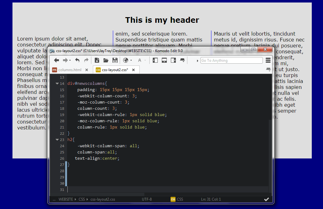
Column Count
This relates to the number of columns that we want. In this example, we want 3 columns. Remember from earlier posts that there are extra lines of code for different browsers.


The above example shows you the basic layout with columns. 3 columns and we haven’t changed any other CSS other than the column-count.
In the next example I will also add some padding to move the text from the sides, at the minute they are a bit too close.
Column Rules
The column rules are the separating lines or rulers that you can have between columns.
Like borders, you can set the line style (column-rule-style), width (column-rule-width), color (column-rule-color).
You can also set all 3 parameters together.


Column Span
In the HTML file I have added a h2 header to the newscolumns container and then refreshed my browser.

If this was a newspaper or magazine, we would probably want our header to be centered across the top of all 3 columns.
To do this, we add a column-span property to our h2 element. This will tell the browser how many columns the header should span across.
So, that is a newspaper/magazine format of layouts with columns. Next we will look at a different type of layout with columns, this may be more the sort of layout you are used to seeing on-line.
3 Column Layout
Rather than thinking of a newspaper/magazine layout, let’s look towards the 21st century and think about how layouts with columns look these days. You may see this layout displaying products, blogs or even on news websites which will display part of stories or categories and you can click on for more.
The latter is the type of site we will bear in mind when working through these examples.
We are going to create 3 containers inside our main container. Each container will be a ‘column’ on our web page. For the sake of simplicity, we’ll call them leftcolumn, middlecolumn and rightcolumn.
Each container is a column, we will set the widths and the margins between each column too.
Size Does Matter!!
Our webpage is going to be 960px wide, that does not mean that each column will be 320px wide. When working out the measurements you must ensure that the sum of the margins, borders and containers do not total greater than the main container width, otherwise they will not display as 3 containers side by side.
HTML
Below is how our 3 column containers looks in HTML.

Each column has a h2 header with a type of news.
Then a paragraph with some fake news content and ending with a “Read More…” link. I have used a “#” in place of an actual link, you can put in a link if you want here.
The CSS for each of the 3 columns is the same as each other.

By now, there should be nothing new to you in the above code.
Remember, the sum of any margins, borders and containers should not be greater than the width available to you!!
This is how the HTML and CSS display in a browser…

What To Do Next?
You should be able to amend the CSS code you’ve seen in this example to make a much more impressive looking layout whether you go with the layout with 3 columns or the 3 column layout…. or whatever number of columns you choose.
Try adding shadows to each of the containers, add a navigation menu to your page, change the colors….. the options are endless!
